Search

Tuesday, November 6, 2018

Draft magazine cover

Recently, along with fine-tuning my edit, I have begun working on the cover for my magazine. My main inspiration for this has been Esquire, which has a very sleek, elegant style that communicates luxury. My magazine will be a similarly luxurious magazine aimed at men.


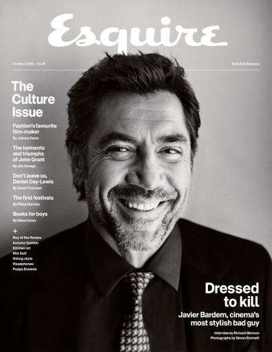
This is the current design which I have - the title and all of the text are only temporary and will be modified later. The sketch is also just a demonstration of what the image will be like (I will be doing a photoshoot soon with the actors). I want the cover to be completely grayscale apart from the background at the top, similar to this issue of Esquire
.Image result for esquire

Wednesday, October 10, 2018

My rough cut


Here is the rough cut for my TV production. Feel free to watch it and leave any suggestions in the comments section (and please be as honest and critical as possible). One thing to note is that the sound is very unfinished, so try your best to ignore this if possible. If you have a bit of time to answer some specific questions, some things which I would like specific feedback on are:


1. Do you think the chase at the start is exciting? Is it too long, does it feel awkward, etc? Does the music feel out of place?
2. Does the transition from the chase into the confrontation scene feel too sudden/awkward?
3. Does the dialogue feel awkward in any places in the confrontation scene?
4. Do you think the confrontation scene needs any music?
5. Does the romance aspect make sense to you? Does it feel out of place/shoe-horned in?
6. What are your favourite/least favourite aspects of the clip and scenes in the clip?


I showed the clip to both of my media studies teachers for feedback. Both of them liked it overall, but gave some tips to improve it. One thing which one teacher suggested was to try cropping some shots in the confrontation scene in order to get a wider range of camera angles and increase the intensity of certain moments. They also both suggested making the opening chase shorter by using shorter shot lengths and possibly experimenting with jump cuts. One criticism was that the romance aspect felt a bit shoe-horned in, although I think this is partly as the scene comes near the end of the show, and by this point the audience would be familiar with the fact that the two are in a relationship. This may, however, be helped by putting a flashback into the dialogue scene, which I will be doing in order to meet the criteria of having at least two locations. This should also break up the scene a bit more and hopefully make it more interesting.

Tuesday, October 2, 2018

Filming my project


Action shot!
 On Tuesday, I completed the bulk of my filming and overall, I am very happy with how it went. After college, I met with my actors and a couple of others who were helping out with sound, reflectors, etc. and we walked over to the location. We started filming at around 4:30pm and finished around 7:30pm. When we arrived at the location, an immediate problem which I noticed was that some construction work which had begun since I had recced the location, creating a lot of background noise. As there was not much I could do about this I decided just to proceed with filming and that, if necessary, I could dub the dialogue later. Having now reviewed the footage, I think that ADR may be necessary as, although the dialogue is clearly audible and sounds fine by itself, the background noise changes and goes on and off between takes.

I divided my time into three hours, spending the first hour filming the dialogue scene, the second hour filming the opening chase and the third hour (after sunset) filming the end scene. I managed to stick to schedule very well and managed to get all the shots I wanted in the three hours without having to rush too much, so hopefully no re-shoots will be required. I was very pleased with the performances which my actors gave, and I didn't have to give them much direction at all. They also worked very hard for the chase scene and were willing to do lots of running. Two shots which I was especially pleased with were a pair of lateral tracking shots which I filmed from a moving car of each of the characters running, as I had been sceptical about whether this would turn out as I envisioned it.

I will now begin to edit the footage and see how long it is, before deciding whether to film a flashback and/or a later scene, depending on how much time I need to make up.


Esquire - October 2018 issue


Esquire Magazine SubscriptionTo begin my in-depth analysis of lifestyle magazines, I looked at the October 2018 edition of Esquire magazine - a high-end men's lifestyle magazine. The magazine costs £4.35 and has a total of 177 pages which are divided into four categories: regulars (10 pages), style (83 pages), culture (11 pages) and features (56 pages). The adverts in the magazine are dominated by men's fashion, with lots of luxury designers such as Louis Vuitton, Ralph Lauren and Giorgio Armani. There are also some other products such as Land Rovers and luxury cruises.


Some of the film and TV articles in the magazine include an article entitled "The best possible taste" which is about Luca Guadagnino and his upcoming film 'Suspiria' and another article called "Supervillain" about Javier Bardem and his upcoming role as Pablo Escobar in the film 'Loving Pablo'.


The main focus of the magazine's front cover is a medium close up of Javier Bardem. In the photo, Bardem is smiling and looking directly at the camera (direct address), creating a friendly and personal connection with the audience. The image is in grayscale and Bardem is wearing a black suit which gives a sense of luxury, making the magazine seem more sophisticated. The heading of the cover is 'Esquire' (the name of the magazine) and it is placed in a central position at the top of the cover so that it can be seen when placed behind other magazines. The title doesn't especially stand out, however, as it is in white against a light grey background so as not to detract from Bardem, being the main focus and selling point of the magazine. The top of Bardem's head is in front of a line and the bottom part of the 'q' in 'esquire', making it seem like he is bursting out of the page and adding depth to the composite. The text on the cover page is very simple and minimal, adding to the sense of sophistication and making the cover very clear and easy to navigate. The contents of the magazine is in a column on the left hand side of the magazine, and the title 'Dressed to kill' is in the bottom right, emphasising this article as the main focus of the magazine. The title of the magazine is in a handwriting-style font which contrasts to the simple sans serif font used for the rest of the text.

I couldn't find any double-page spreads in the magazine, so instead chose to look at an article on Luca Guadagnino, given that he is a film director and the article focuses on an upcoming film of his, 'Suspiria'. The layout of the article is very simple and sleek-looking, with large images and blocks of text. The image on the first two pages of the article shows Guadagnino in his home, relaxing. This suggests that the article focuses on Guadagnino himself more than his upcoming film, and that it discusses his personal life. The title and header at the top of the page are both in a sans serif font whereas the main article is in a serif font, separating the two and making it easier to navigate. The text is against a white background and is arranged in columns.  The layout is, in many ways, similar to a newspaper, which suggests that it is reliable and informative. I can see myself using a similar layout for my double page spread, as I will probably opt for a similarly luxurious look (as most men's lifestyle magazines do).

The second page shows what looks like it could be a still from a film of his, 'Call Me by your Name' (although I'm fairly sure that it was taken by an on-set photographer). In the actual text of the article, the writer begins by describing Guadagnino's home before talking about his filmmaking career, the interviewer's own experience meeting Guadagnino, and finally the actual interview which focuses around 'Suspiria' and the director's filmmaking methods. Unlike a magazine aimed specifically at film and TV fans (like 'Empire' or 'Total Film'), the article talks just as much about the director himself as he does about his work. This is something which I will have to consider when creating my article, and I will definitely have to focus the article around either myself, as the director, or one (or both) of the actors more than the actual TV show.

Sunday, September 30, 2018

Aims and intentions

For my cross-media production, I chose the genre of crime drama as I found, through my research, that this genre is popular with my target demographic of 18-35 year old 'millennials'. I will use media language to conform to my product's industry context and to create liberal representations which would appeal to my target demographic. The colour palette for my audio-visual sequence will include lots of natural, muted colours like greys and blues, similar to recent successful ITV crime dramas such as Broadchurch. Towards the beginning of my sequence, for a chase scene, I will use tense music with a fast tempo to build a sense of energy and threat. Later, the music will become more melancholy and emotional, reflecting the feelings of Dave, the protagonist, aligning the audience with him. For this scene, I will use handheld camera for shots of Michael, the killer, to show his instability, whereas stable shots will be used for Dave to show how he is managing to stay calm and collected. This camera-work also suggests that Dave has the moral high ground and that murder, even for political and ethical reasons, is morally wrong, which reflects the dominant ideology in the UK. To further emphasise this, I will use soft, flattering lighting on Dave's face in contrast with harsh light with lots of shadows on Michael's face. The main location for my drama will be a run-down urban street which will create a gritty, realistic tone that is common in crime dramas. I will direct my actors to give very opposing performances in order to create a sense of conflict. The character of Michael will be very physical, loud and intense whilst Dave will remain quiet and understated.

I aim to create a positive, non-stereotypical representation of gay men, as this is a social group which I found has not been sufficiently portrayed in crime dramas, and I think that it would be an important step forward in inclusiveness. From my research on millennials, I found that most millennials are liberal and forward-thinking, so would appreciate this kind of representation. In order to create this representation, the protagonist will be gay, and I will avoid stereotypes like brightly-coloured clothing and performance elements such as feminine mannerisms.

Steve Neale's theory of repetition and difference states that, in order to please audiences, media texts must both repeat tried and tested formulae and also have enough surprises and twists on the genre to make it interesting. In my crime drama sequence, I will include conventions of the crime drama genre such as urban locations, narrative twists, natural lighting and themes of good, evil, and the relationship between police officers' work and personal life. However, I will also subvert expectations in some areas, following Neale's theory in order to please the audience - the two main detectives in my TV show will be gay, and one of them will also be the killer which they have been chasing for the whole series.

In order to demonstrate digital convergence, I will include an image of the two main characters across my magazine and advertising along with a logo featuring the title of my show, 'Partners', creating a brand identity. The costumes which these two characters wear will also be recognisable and will signify the procedural crime genre. In the magazine article itself, there will be an article with either the director or cast of my drama.