 To begin my in-depth analysis of lifestyle magazines, I looked at the October 2018 edition of Esquire magazine - a high-end men's lifestyle magazine. The magazine costs £4.35 and has a total of 177 pages which are divided into four categories: regulars (10 pages), style (83 pages), culture (11 pages) and features (56 pages). The adverts in the magazine are dominated by men's fashion, with lots of luxury designers such as Louis Vuitton, Ralph Lauren and Giorgio Armani. There are also some other products such as Land Rovers and luxury cruises.
Some of the film and TV articles in the magazine include an article entitled "The best possible taste" which is about Luca Guadagnino and his upcoming film 'Suspiria' and another article called "Supervillain" about Javier Bardem and his upcoming role as Pablo Escobar in the film 'Loving Pablo'.
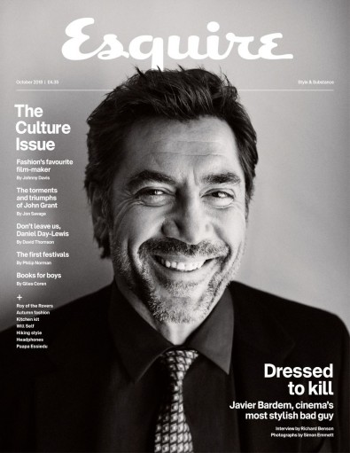
The main focus of the magazine's front cover is a medium close up of Javier Bardem. In the photo, Bardem is smiling and looking directly at the camera (direct address), creating a friendly and personal connection with the audience. The image is in grayscale and Bardem is wearing a black suit which gives a sense of luxury, making the magazine seem more sophisticated. The heading of the cover is 'Esquire' (the name of the magazine) and it is placed in a central position at the top of the cover so that it can be seen when placed behind other magazines. The title doesn't especially stand out, however, as it is in white against a light grey background so as not to detract from Bardem, being the main focus and selling point of the magazine. The top of Bardem's head is in front of a line and the bottom part of the 'q' in 'esquire', making it seem like he is bursting out of the page and adding depth to the composite. The text on the cover page is very simple and minimal, adding to the sense of sophistication and making the cover very clear and easy to navigate. The contents of the magazine is in a column on the left hand side of the magazine, and the title 'Dressed to kill' is in the bottom right, emphasising this article as the main focus of the magazine. The title of the magazine is in a handwriting-style font which contrasts to the simple sans serif font used for the rest of the text.

 I couldn't find any double-page spreads in the magazine, so instead chose to look at an article on Luca Guadagnino, given that he is a film director and the article focuses on an upcoming film of his, 'Suspiria'. The layout of the article is very simple and sleek-looking, with large images and blocks of text. The image on the first two pages of the article shows Guadagnino in his home, relaxing. This suggests that the article focuses on Guadagnino himself more than his upcoming film, and that it discusses his personal life. The title and header at the top of the page are both in a sans serif font whereas the main article is in a serif font, separating the two and making it easier to navigate. The text is against a white background and is arranged in columns. The layout is, in many ways, similar to a newspaper, which suggests that it is reliable and informative. I can see myself using a similar layout for my double page spread, as I will probably opt for a similarly luxurious look (as most men's lifestyle magazines do).
The second page shows what looks like it could be a still from a film of his, 'Call Me by your Name' (although I'm fairly sure that it was taken by an on-set photographer). In the actual text of the article, the writer begins by describing Guadagnino's home before talking about his filmmaking career, the interviewer's own experience meeting Guadagnino, and finally the actual interview which focuses around 'Suspiria' and the director's filmmaking methods. Unlike a magazine aimed specifically at film and TV fans (like 'Empire' or 'Total Film'), the article talks just as much about the director himself as he does about his work. This is something which I will have to consider when creating my article, and I will definitely have to focus the article around either myself, as the director, or one (or both) of the actors more than the actual TV show.
Good analysis. Try to use more media specific language eg masthead. Are you happy with the term 'double page spread'?
ReplyDelete